
It’s Sew Mama Sew’s give-away day! Have some fun clicking around to all the fabulous blogs giving away goodies. Once you’re done entering my give-away below, visit the other blogs here.

If you’re new here to the Quilting Gallery .. welcome! I’m Michele Foster, aka Mishka. I hope you’ll spend a few minutes checking out the various sections of my site from the links above including the most popular Quilting Bloggers Directory – with more than 6,200 quilting friends from around the world.
Also, each week I host a weekly themed quilt contest too. The theme for this weeks contest is Creative Expression. Quilters are free to interpret this theme as they see fit. Any quilting style is acceptable. You can submit quilts, wall hangings, pillows, etc. as long as the item you enter is completely finished (i.e. bound and quilted). Enter here!

You can keep in touch by subscribing to my weekly newsletter or our Facebook group.
Give-Aways
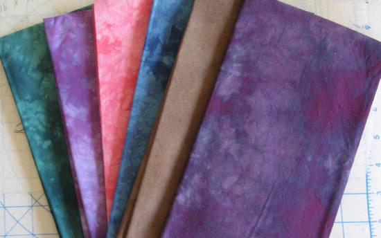
I’m giving away these six gorgeous hand-dyed fabrics from my collection:
To enter the give-away, leave a comment below answering, To add some pop to a quilt, what colour would you use. One entry per person. Winner will be selected randomly May 26th. I will ship worldwide.
Also, I’m hosting a give-away for MyMemories Suite scrap booking software. This give-away is open until May 23rd, enter this give-away here.

Congratulations to winner #161 Becky. Look for an email from me.


I’d add the pink
I find some pure black makes the other colors in the quilt light up.
I’d use orange.
I want to try black! Using it to showcase some bright colors, I think it would definitely make them pop!
Thank you!
It depends, but I usually lean towards yellow
I usually pop with red.
POP! I’d add yellow or spring green.
Not red! Definitely not red!
I think it depends on the fabrics already used. Sometimes a solid in a corresponding colour can help the other colours pop. I’m also a firm believer in black, especially if using brights.
I’d use a bright banana yellow to make it pop!
Ik denk dat een mooie lavendel paars of zonnig geel, afhankelijk van de stof en het ontwerp.
Either white or black can give a quilt some pop. Thanks for the chance to win.
Lime green…my all time favorite!
I use teal to make a quilt pop. Thank you for a chance to win .
I love to throw in some bright red or yellow to make a quilt pop!
Hello Michelle,
Thanks for the chance to win your beautiful fabric. I would say it is like gardening, red and yellow roses always stand out in the garden. So red and yellow it is.
Happy days.
Bev.xoxo
Yellow!
I would add some orange or bright yellow!
I would add some turquiose! Of course, that’s if it goes well with the other colors!
I would add yellow or lime green. Thanks for this giveaway, the fabrics are lovely!
I think I would use yellow.
Purple … is there any other color to consider.
I have loved blue green or green blue since I got my first box of crayons & could find a way to use teal in everything, you can’t go wrong with teal!
I look for the “minority” color, most often the “majority’s” opposite. For example, the quilt is mostly yellow and orange…add a yellowed-blue like robin’s egg or tealy-aqua…gives just the right amount of zippity-doo-dah!
Thanks for the chance to win. Lately I’m gravitating toward lime and tangerine.
A lime, robin’s egg blue or yellow!
Love the purple to add “pop” to the jacket I want to make!
I like to use a yellow or lime green to make something stand out.
I would use red or orange. Thanks for the chance to win.
Orange! I love orange. I think I need a new project with a pop of orange!
Orange and purple are great eye poppers for me
I once heard you should add a pop of purple to every quilt. My favorite is a pop of a black & white print.
It really depends on the colour scheme of the quilt, but yellow is generally such a bright and happy colour which will match a lot of colour combinations.
Gosh … it really depends on what’s already being used. Orange or purple are my ‘go to’ colors … but I can see where a lime green would really sizzle, too! :)
With batiks and art fabrics, I like to use black as sashing or borders, it really makes the rest of the colors pop.
Debbie
I usually find any solid adds a pop when you’re using prints. Lime green is a fun one!
Well, it depends on what other colors I’m using, of course, but I tend towards yellows and oranges or lime green for pops. :)
It all depends on the other colours, but I always like a good bright red!
Definitely depends on the other colors in the quilt. Love a pop of bright in a quilt.
Diría verde lima, turquesa y si no los tengo o no combinan el negro siempre esta a la mano .Gracias por su generoso regalo.
I think my favourite to pop would be turquoise.
A deep shade of red.
I love orange for a pop of color.
Black really makes a standout quilt I think.
I think Red always adds POP! :) Thanks for the chance at this lovely bundle too!
To make a quilt pop I might add a bright color to muted tones. I also like to use black, which can have a dramatic effect. Thanks “sew much” for the chance to win!
Red or yellow. Thanks for the giveaway!
To add pop I always add a bright color, red or yellow.
I would go yellow!
Michele, I love seeing all the new quilts every week – and reading the stories that inspire them! I also love seeing Milo’s adventures & how he’s growing! (never enough puppy pictures!!)
I think the fabrics you’ve offered are simply GORgeous, and that pink is already supplying that pop you were looking for!!
Orange would pop in a lot of color schemes.