Please join me in welcoming today’s guest blogger Brenda Pinnick as she shares with us her love of colour and a few tips on design composition. She’s also giving away some pre-cut fabric shapes of her fabric using Sizzix dies – read below to fine out how to enter.
My name is Brenda Pinnick and I am an artist, a colorist and a graphic/product designer. I live in the Atlanta (Georgia) area and work in my home studio with my little dog Paisley always at my side and my two cats, nearby. I have a brand new (first) grandbaby and am over the moon in love with her! I am a graduate of Creative Circus, a portfolio and design school here in Atlanta and have worked for Hallmark Cards as a surface designer/graphic designer and for Plaid Enterprises as an Art Director/product designer. I have been working independently now for about 5 years and have licensed my art for scrap booking kits sold on QVC, in stores and on line. I also design art for Sizzix diecuts (for paper and fabric) and for fabric with Henry Glass.
One of my earliest and best memories of my Mom, is she and I spending time with her stash of fabric. While she sewed, I would sit next to her and be endlessly entertained with nothing but that glorious pile of color and pattern. I remember folding it into shapes, draping it over my body to mimic a cape or a gown, sorting it, rolling it into a ball and laying out the bits and pieces of leftover scraps to create art. I still love to do all those things! And I’m guessing that each of you do as well! I’ve often wondered what it is about fabric that so many women and some men connect to. Maybe it’s the possibilities, the way in which it can be transformed to become a personal statement. Or maybe it’s the soft and gentle – so comforting in times of stress or uncertainty. Or maybe it’s just the delicious colors and enticing pattern that gives off some type of endorphin in our brain?! Honestly, I think it’s all of that, don’t you?
My dream has always been to design fabric and I am proud to be on the cusp of my third collection with Henry Glass & Co. Here’s where I confess – I am not a quilter. At least, not a proper quilter as in measuring, planning or precise execution. Oh, one day, maybe, I will go down that road but for now, my heart is back to those early days of simple play.
For me, it all starts with color. Color dictates the mood, then the theme and finally the layout. Color is much, much more than the surface level of picking hues. Learning to use value and saturation is critical for success while the third level is quantity and placement.This is where I see many designs loose their impact. While a color palette of all one saturation level is harmonious, it can also be without interest. And learning how to use placement and quantity will create movement, hierarchy and balance to a composition.
Today, I’m showing you an artpiece I made using some of my latest collection as well as some fabrics from Kaffe Fasset (whom I admire immensely). I also used a bit of felt and some scraps and bits from my scrap basket. I choose burlap for the neutral yet textured background, knowing I wanted to use hot pinks, intense green/yellow and a deep, saturated blue.
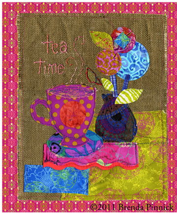
There a couple of things I want you to notice about this piece. While I’ve used both warm and cool hues and they are similar in quantity, I’ve isolated a large, warm area on the lower right to support the cool blues and magentas found in the rest of the elements. By allowing it to be a somewhat restful zone for the eye, the saturation level is in line with the other pieces. Notice also the neutral background shown is almost a perfect 50/50 proportion to the design elements. This area is the most restful, with saturation at a low level and the texture of the weave offering a nice counterbalance to the patterned pieces. Now look at the placement – I’ve stair-stepped each hue to create repetition and movement. Start with blue, lower left and moving upwards and to the right. Next look at the magentas and then the greens. Each has repetition and variety in shape and quantity, creating a nice interest but still harmonious.
Next time you’re looking for a quick and easy project to use up some of your stash, try a little color play like this. It’s fun and will get you thinking more about using the design tools mentioned above. The nice thing about color is that it costs no more to use! It’s like having a free tool in your tool box, an endless supply of possibilities and above all else, is just fun to use!
If you would like to learn more about my workshop offerings, please visit my website. Also, please check out my Sizzix dies for sewing.
If you leave a comment on this post here AND one on my blog, you could win a set of pre-cut shapes using my fabric and my Sizzix dies! I will announce the winner on January 30th on my blog!
Happy quilting, friends!
Brenda Pinnick
Wonderful story and I love your suggestions and ideas! Great little art quilt with some unusual combinations…good for all of us to think outside of the box..never would have thought of burlap..and I love burlap!
Leaving a comment on both… you are inspiring!!
Yes inspiring indeed and I love the burlap also.
Well, this is where they seperate the men from the boys or ‘artists’ from us quilters :) I’d like to know more about balance and composition etc, but it certainly doesn’t come naturally. I wonder why I’m a quilter because I’m not so great with color either! I do like fabric and frugality, so a use it up mentality is my forte….
I would love some die cut shapes…I’ve never seen the Sizzix machine…only the GO cutter. Will have to investigate that. Thanks for the chance.
Love the vibrant colors and the simplicity of the design.
Your tea time quilt is lovely. Thank you for explaining the design process for your art quilt.