Last Monday, after days of working on them, I finally finished and submitted my taxes, with a couple of hours to spare. I was behind a year, so it was twice as much work to get caught up. It definitely feels great to have that huge headache off of my plate. I also put in new systems to help make doing taxes easier going forward.
Feeling proud of myself on Tuesday, I had an early morning appointment then ran some errands. Returned home to get some work done. Wednesday I woke up with a cold. Ok, I could handle a silly cold, keep working, getting caught up, etc. Thursday forget it, the cold got me.
I do feel better today, but it sure does feel like forever since I posted the first Block Library tutorial. Hopefully going forward the blocks will be available more quickly.
Oh well, no more whining, let’s get to today’s block!
#2 Old Maid’s Puzzle
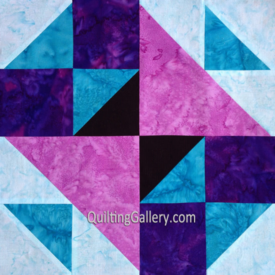
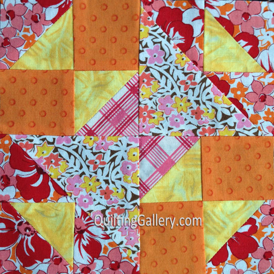
The second block is Old Maid’s Puzzle. You’ll probably recognize this block as it is quite popular in traditional and sampler patterns. I hadn’t made it before, so wanted to include it in my quilt. Here are my two versions.


I made the 6″ finished one in the scrappy fabrics. If I were to do it over again, I would change the centre triangles (stripes) to something that contrasted better with the surrounding fabrics. The striped fabric is lost.
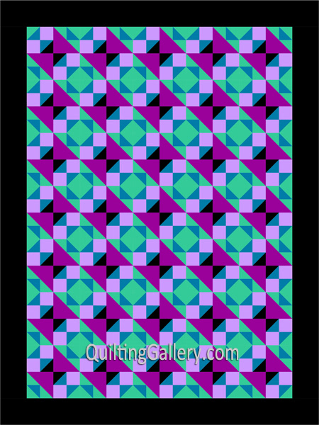
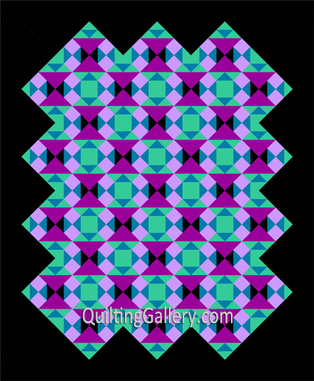
Below are some layout options. I wasn’t crazy about the on-point layout (second option) extended to the borders, so I added setting triangles to the layout. I’m still not crazy about it and think it needs something else, but not sure what. Which one is your favourite?


Share your completed blocks in our Aiming for Accuracy Facebook Group. Don’t miss a free tutorial, subscribe to my weekly newsletter.
If you missed it download the first block: Summer Nights.

Leave a Reply