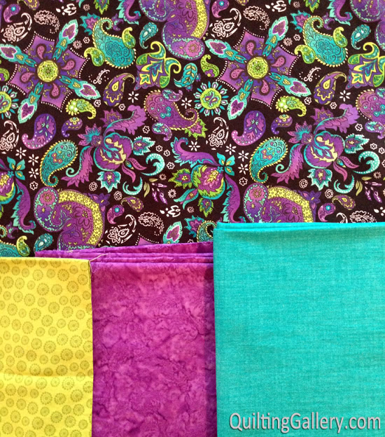
We have a long weekend up here in Canada this coming weekend. I’ll be spending some time working on a couple of new pillows. Here are my fabrics:

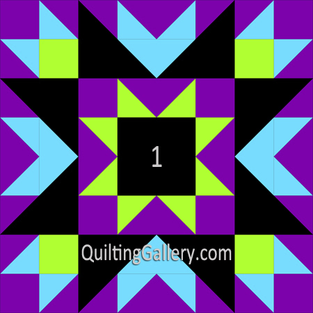
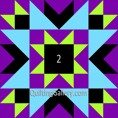
I fell in love with the multi-coloured print, then chose the coordinating fabrics. Below are a couple of layout options. The multi-coloured print is represented by black in the diagrams. I only have a fat quarter of the lime green, so will need to use that sparingly.
Which option do you prefer? I can’t decide … I do want to make them matching pillows.


Thanks for the help!!
Help me decide …
I Like number 1 it catches the eye better!
I prefer #2 … but only you know if you’d like the multicolor print to dominate or be an accent to the bold colors in your other fabrics.
I like #1 and love the fabric choices
I like #2
I like # 2.
#1!
I like #2. I think it’s more balanced.
#1. The multi pattern forms the star within the block, and it will jump out. That fabric is too proud to be merely an accent, as it would be in block#2. It’s GORGEOUS.
I like # 2
I vote for Number 1 – love them both, but think #1 will highlight your lovely print more dramatically. Have a great long weekend!!!
I prefer #2.Beautiful fabric.
I would love nr.1
I like # 2 better. 1 seems like a group of pieces, while 2 is a star and has a clear design.
My eyes is captured by #1. I find it quite pleasing :)
Creo que la opción B parece más juvenil sobre el dibujo, saludos desde Barcelona, Spain, espero que disfrute con la labor que seguro le quedará bonita.
I like 2
I like #1,
#2 is for me….grin. It just feel like it opens up. Your fabrics are so gorgeous….wow and wow.
#1
I like #1 best but either will look good with your lovely fabrics.
I like number 1.
I like #1 because of the way the colors are contained by the black but yet look like they want to burst forth.
I choose number #1..the black colour in that part..its more attractive than number #2 ..^^
I like option #1- I think it’s more dramatic
I adore option #1. I feel the pattern would show off the print fabric better. Although both options are a beautiful choice for a pillow.
#1
The larger pieces for the print fabric will show up well.
I like both. Make one of each,it we’ll be more interesting that way.
I’d say #2!!!
# 1
Personally I Lik Numbe 2.
I love all your fabrics! My favorite pillow is #2.
I like #1, shows off more of the multicolor.
My choice would be #1, as the black would be more prominent.
#2 is my pick!!! Hope it helps you. Have fun sewing and enjoy your long weekend.
number 1
Option #2
Option 1-it will show more of the focus fabric. I’d love to get my hands on that fabric. It’s gorgeous.
Please let us know what fabric line the purple and black print are from! I would love to make my bff a quilt with them
I love your fabrics!
my vote would be for #2
I like #1 best. That being said I LOVE your main fabric!
I like number 1. It will show off the print better.
I like option 2, the star in the middle star stands out better