It’s Sew Mama Sew’s give-away day! Have some fun clicking around to all the fabulous blogs giving away goodies. Once you’re done entering my give-away below, visit the other blogs here.
If you’re new here to the Quilting Gallery .. welcome! I’m Michele Foster, aka Mishka. I hope you’ll spend a few minutes checking out the various sections of my site from the links above including the most popular Quilting Bloggers Directory – with more than 6,200 quilting friends from around the world.
Also, each week I host a weekly themed quilt contest too. The theme for this weeks contest is Creative Expression. Quilters are free to interpret this theme as they see fit. Any quilting style is acceptable. You can submit quilts, wall hangings, pillows, etc. as long as the item you enter is completely finished (i.e. bound and quilted). Enter here!

You can keep in touch by subscribing to my weekly newsletter or our Facebook group.
Give-Aways
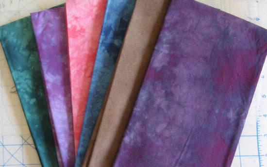
I’m giving away these six gorgeous hand-dyed fabrics from my collection:

To enter the give-away, leave a comment below answering, To add some pop to a quilt, what colour would you use. One entry per person. Winner will be selected randomly May 26th. I will ship worldwide.
Also, I’m hosting a give-away for MyMemories Suite scrap booking software. This give-away is open until May 23rd, enter this give-away here.
Congratulations to winner #161 Becky. Look for an email from me.


Hot Pink or red will work with most of my color combos, but sometimes I stretch it to add black.
Oh, what lovely fabric! Hmm, well, it really depends on what colors you are using in your quilt. If you are using greens, yellows and blues, the a red would give it a good pop. If you are using oranges, browns, greens, then a vibrant blue or a black would give it a good pop… so really, it just depends :)
I would add purple
http://richardquilts.blogspot.com
I am using yellow to give some pop to my predominately blue quilt. Thanks for the chance to win!
bright yellow
yellow!
I would add a bright color like yellow, apricot, salmon, or orange. Thanks for the giveaway!
It depends on what the main colours are, but with the main colours I generally choose red is always good for adding a bit of pop.
Bright white
Bright pink for sure
I usually use a color opposite on the color wheel of what the main color of the quilt is to add the pop factor.
Right now I’m loving orange:-)
When I want to add pop I usually go for red
It would depend on what the other colors are to use in the quilt. I would probably pick yellow.
Probablly a yellow or an amazing purple, anything that draws your eye to it.
yellow
my first thought was red or yellow!
I would use red! Great giveaway!
White, black or red most often; depends on the rest of the colors.
Sometimes juts a little yellow will do the trick . Thanks for the chance to win.
I would use a yellow or an orange to make a good pop…those fabrics are awesome thank you Michele for this great give a way…
I’ve never made a quilt before, but red and yellow seem like good “pop” colors.
I really think bright yellow adds a pop. Thanks for the chance! Beautiful
Purple.
Last time I needed a little pop I added teal. Just a tiny bit, it was a wonky log cabin black and white and purple. You’d think the purple would do it but the teal was great. Thanks.
Orange or red, I think.
I would use Orange! mjalfano19@gmail.com
I love to deep red or turquoise to add a burst of color, especially together with mustard yellow and gray!
I would probably add red! thanks
I always like adding bits of bright orange
If the quilt had colour in it then I would add a grey. This makes all the other colours pop without making the colours fade or look washed out. If it needed colour then I would use a green or blue as it blends with most other colours. However, my favourite colour to use in quilts is purple.
i think purple makes quite a statement almost always! thanks for the opportunity and have a great day
Yellow.
White
Pea green
Blue.. Thanks for the chance to win…
Thanks for participating…I found myself for the first time EVER using white in a quilt. Never in my life would I think to use it but someone had suggested it and when I did the quilt came to life!!! Strange how just one color can change the overall look of a quilt!!
I’d say white – it makes all of the other colors more vivid!
I’ve been thinking about this, and it really does depend on the quilt and your other colors. I am choosing fabrics for one quilt right now that is mostly blues and teals, but I’m putting in some orange for “pop”. Then I’m designing another quilt for a friend using a lot of darker colored batik fabrics that she collected while traveling in Africa, and I’m trying to decide how to make them pop — maybe black…. Anyway, thank you very much for the giveaway!
After much thought I conclude it depends on the quilt – sometimes a quilt needs pulling back to pop – Grey or white. Sometimes it needs contrast though
Well since I lean toward earth tones, orange or red would be a great pop of color. Or perhaps a nice vibrant turquoise on a quilt of green and brown? Thanks for making me think!
To add pop I like to add a bright purple or contrasting color. Thanks–I’m going to check out your weekly challenges!
Your fabric is lovely! If I were to add some color to a quilt if would probably be a combination of teal, purple and pink. Those are my favorite colors and I think they work well together.
If it’s a light coloured quilt some egg plant purple and if it’s a dark coloured quilt some yellow or lime
Based on additive color theory, I use a complimentary color to the main color of my quilt. So if its blue, I use yellow, etc.
I like to use poppy red, lime green, or a bright yellow, especially in the binding.
I have been using a bright yellow to add POP lately. Although I have used a lime green for the same effect. Both of them look great with purple.
Usually anything bright, but if I have to pick a color, yellow is a good choice . . . bright yellow.
orange… definitely
winterwrens at gmail dot com
I definitely would pick red for a pop!