Give-Away Day!

GiveawayDay

It’s Sew Mama Sew’s give-away day! Have some fun clicking around to all the fabulous blogs giving away goodies. Once you’re done entering my give-away below, visit the other blogs here.

Michele Foster's Facebook profile

If you’re new here to the Quilting Gallery .. welcome! I’m Michele Foster, aka Mishka. I hope you’ll spend a few minutes checking out the various sections of my site from the links above including the most popular Quilting Bloggers Directory – with more than 6,200 quilting friends from around the world.

Also, each week I host a weekly themed quilt contest too. The theme for this weeks contest is Creative Expression. Quilters are free to interpret this theme as they see fit. Any quilting style is acceptable. You can submit quilts, wall hangings, pillows, etc. as long as the item you enter is completely finished (i.e. bound and quilted). Enter here!

Weekly Themed Quilt Contests

You can keep in touch by subscribing to my weekly newsletter or our Facebook group.


Give-Aways

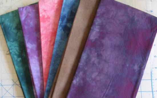
I’m giving away these six gorgeous hand-dyed fabrics from my collection:

hand-dyed

To enter the give-away, leave a comment below answering, To add some pop to a quilt, what colour would you use. One entry per person. Winner will be selected randomly May 26th. I will ship worldwide.

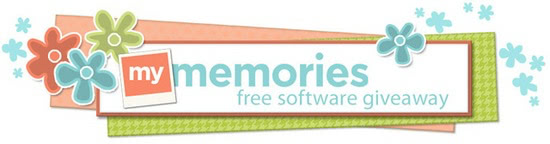
Also, I’m hosting a give-away for MyMemories Suite scrap booking software. This give-away is open until May 23rd, enter this give-away here.

my-memories


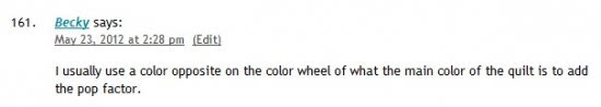
Congratulations to winner #161 Becky. Look for an email from me.

random 161

winner 161


271 responses to “Give-Away Day!”

  1. Wanda Avatar
    Wanda

    It depends on the colors used in the quilt itself. White sometimes does it or a bright color that’s not a main color used in the color scheme.

  2. Linda Brown Avatar

    I think I would add a punch of yellow to the mix not a bright one but a mottled one.

  3. Jennie P. Avatar

    I would use orange for pop.

  4. Melissa Avatar

    I like to use Red for pop

  5. Lorraine Williams Avatar
    Lorraine Williams

    I love a deep golden yellow for pop, or a bright hot pink, depending, of course, of the other colors.

  6. Jen in KS Avatar

    From the selection above, the easy pop is pink. However, I’m partial to teal and would make that work into some sort of zing. Thanks for the giveaway!

  7. Susan Avatar

    I like to add a touch of red, even if it’s just quilting with a heavier red thread.

  8. Marjo B-W Avatar

    I would use a some turquoise, it fits well with most other colors and brightens up the whole quilt!

  9. Erika Avatar
    Erika

    In a quilt with modern theme I’d add silver with a metallic sheen. In a vintage quilt I would add yellow/gold/cheddar. It all depends on the other colors in your quilt.

  10. Shannon Avatar
    Shannon

    I think a yellow would make it pop!

  11. Tabatha Avatar
    Tabatha

    I think a nice lavender purple or sunny yellow depending on the fabric and design. Both are very calming and uplifting to me!

  12. Christy Avatar

    I usually add yellow or lime green if I want to brighten up a quilt.

  13. Judy Avatar
    Judy

    It would depend on the quilt but I think that red if it works adds pop to anything.

  14. Stray Stitches (Linda G) Avatar

    I like to add a bright lime green or yellow to make a quilt pop – especially if it has a dark background. Thanks for the opportunity to enter your wonderful giveaway!

  15. Cheryl Hartzog Avatar

    I love the pink but I think I would use the teal or purple in my next quilt .
    Thank you for the chance for this give away.

  16. BJ Wright Avatar

    I would add dark purple/black to make batiks pop. Black always makes colors pop, but it shouldn’t be used too strongly.

  17. Mary Rogers Avatar
    Mary Rogers

    Gold or yellow gives a pop to any quilt. Whenever I have a quilt that lacks a wow I ad yellow and it works every time.

  18. ThatCleverClementine Avatar

    I usually find that a citrus color works: depending on the circumstances, a yellow or lime, maybe an orange?

  19. LeAnne L Avatar
    LeAnne L

    A pop would normally be yellow or red.

  20. Rafael's mum Avatar

    How about bubblegum pink?

  21. Julie A Avatar
    Julie A

    A bright yellow or orange always gives a pop.

  22. M-R @ Quilt Matters Avatar

    Ooh, yummy! To give pop, I’d add yellow. Thanks for the giveaway, Mishka!

  23. Carla J Avatar
    Carla J

    I would choose an off-white hand dyed fabric because it not only makes the colors pop but it’s also very summer-like!
    I think it’s a good choice because other more bright colors would take all the attention away from the beautiful ones shown in the picture…

  24. ~ Julie ~ Avatar

    Red is my favorite color, so if it would match the quilt I’d definitely use red! Thanks for the opportunity to win such a great giveaway! I love those fabrics! πŸ™‚

  25. Sue Avatar
    Sue

    I always think adding a shot of lime is just the pop most quilts need!

  26. Linda Dixon Avatar
    Linda Dixon

    All of the colors!

  27. Annika Avatar

    Any of your fabric would give that extra special to a quilt! Thanks for the chance of winning.

  28. Missy Avatar

    I absolutely love those fabrics! To add color for pop, it would depend on the quilt. For a balck and white quilt I usually add red, however on other quilts, my favorite color is yellow, however I am hand piecing a quilt right now and the popping color is blue and purple.

  29. Deborah Avatar

    I choose purple when I want some bling. This royal color usually adds just what the quilt needs. I am finishing an autumn quilt where I added a little purple here and there. Really made it POP!
    Thanks for the chance at the give away!
    Hugs, Deborah

  30. Sher S. Avatar
    Sher S.

    I add some POP to my quilts I usually will add yellow or a few pieces of orange. That will make just about any quilt pop. But again it all depends on what colors are in the quilt as to which color to add for the POP effect.

  31. Madeline Avatar

    To add some pop to a quilt, a bit of spicy orange or sunny yellow always seems to do it for me.

    Thanks for the awesome giveaway.

  32. Quilt Rat Avatar

    Well it all depends on what the quilt tells me it needs. Lol. But my answer is likely ORANGE. I adore oranges…..especially a piece that has bits of cheddar yellow and runs through the orange on its way to a brilliant flame red.

  33. WaggonsWest Avatar

    Lime Green…. today.

  34. Denise J. Avatar
    Denise J.

    I’ve found that black really makes bright colors pop. But also a little yellow or a brighter green pops too

  35. Sally Avatar

    to add some pop? Yellow (my favorite colour!), or use black as background to make all the rest pop!

  36. Sally Avatar

    oops, forgot to say–WOW, those hand-dyes are gorgeous! They would make an awesome statement and pop all their own!

  37. Nancy Heffner Jacobson Avatar
    Nancy Heffner Jacobson

    I’m in a rut I guess, but I virtually always use some shade of RED.

  38. Diane Avatar
    Diane

    I would say red or orange…but it really would depend on the other colors in the quilt.

  39. Mary Avatar
    Mary

    I think a dash of yellow or gold helps a quilt pop.
    Thanks for a chance at those beautiful dyed fabrics!

  40. Karen U Avatar
    Karen U

    I think bright yellow or a bright pink is just the pop needed on my quilts.
    Thanks!

  41. Dawn Meador Avatar
    Dawn Meador

    Thanks for the giveaway! I always add red or yellow!

  42. Susan Avatar
    Susan

    Depending on the colors of the quilt, I would use something unexpected. For example, if the quilt is mostly blues, maybe an orange may work…

  43. Heather Seibel Avatar
    Heather Seibel

    Yummy – those are my favourite colours (minus the red!) Beautiful hand-dyes, Michelle. The colour I’d use to pop a quilt depends on what colour palette I’ve chosen. I’ll try to find an obscure colour in the print fabric I’ve chosen – always a bright one – and then use that for a zinger; piped edging, or an accent block. I don’t chose that fabric until I have my top together, and then I go looking for a colour that will add that ‘something extra’ to the quilt!

  44. Gerrie Avatar
    Gerrie

    To add pop to a quilt I would use Hot Pink this is my first visit to your site and I have just signed up for your newsletter thanks for the chance to win these beautiful fabrics .

  45. Terri Avatar
    Terri

    Red always makes a great pop of color.

  46. BrendA Avatar
    BrendA

    I really depends on the main portion of the quilt. If it is mostly dark then a lighter color could really punch up the quilt, but if it is a lighter quilt then maybe a darker color would add the punch of color it may need.

  47. Sallie Avatar

    These are gorgeous! I like to add red or yellow to a quilt. Thanks for the giveaway!

  48. Rita Goshorn Avatar

    usually add some red, yellow or orange, depending on the basic colors used. love your hand dyes! adding some of those colors will add pizzazz to any quilt. thanx for the chance to win them.

  49. Jayardi Avatar
    Jayardi

    β€’ β€’ β€’ I like to use red!

  50. Tammy Flannigan Avatar
    Tammy Flannigan

    I like a sunny yellow – it is neutral, and since most of my stuff is for kids I try and stay away from pinks and blues unless you know for sure it is for an boy or girl.

  51. Teresa Mitchell Avatar
    Teresa Mitchell

    I’d add the pink

  52. Karen Avatar
    Karen

    I find some pure black makes the other colors in the quilt light up.

  53. Laura Avatar

    I’d use orange.

  54. Anita Avatar

    I want to try black! Using it to showcase some bright colors, I think it would definitely make them pop!

    Thank you!

  55. Desiree @ Wee Share Avatar

    It depends, but I usually lean towards yellow

  56. Billie K Avatar

    I usually pop with red.

  57. Mary Avatar
    Mary

    POP! I’d add yellow or spring green.

  58. Clare Avatar

    Not red! Definitely not red!

    I think it depends on the fabrics already used. Sometimes a solid in a corresponding colour can help the other colours pop. I’m also a firm believer in black, especially if using brights.

  59. Anna Avatar
    Anna

    I’d use a bright banana yellow to make it pop!

  60. Williw Avatar

    Ik denk dat een mooie lavendel paars of zonnig geel, afhankelijk van de stof en het ontwerp.

  61. Joyce Mitchell Avatar
    Joyce Mitchell

    Either white or black can give a quilt some pop. Thanks for the chance to win.

  62. Jo Avatar
    Jo

    Lime green…my all time favorite!

  63. Tina Avatar

    I use teal to make a quilt pop. Thank you for a chance to win .

  64. Jennifer Dancy Avatar

    I love to throw in some bright red or yellow to make a quilt pop!

  65. Bev C Avatar

    Hello Michelle,

    Thanks for the chance to win your beautiful fabric. I would say it is like gardening, red and yellow roses always stand out in the garden. So red and yellow it is.

    Happy days.
    Bev.xoxo

  66. Carin Avatar

    I would add some orange or bright yellow!

  67. Garilyn Avatar

    I would add some turquiose! Of course, that’s if it goes well with the other colors!

  68. Anne-Marie Avatar
    Anne-Marie

    I would add yellow or lime green. Thanks for this giveaway, the fabrics are lovely!

  69. Marilyn M Avatar
    Marilyn M

    I think I would use yellow.

  70. sheila Avatar

    Purple … is there any other color to consider.

  71. Sheri Goltz Avatar
    Sheri Goltz

    I have loved blue green or green blue since I got my first box of crayons & could find a way to use teal in everything, you can’t go wrong with teal!

  72. Barbie Kanta Avatar
    Barbie Kanta

    I look for the “minority” color, most often the “majority’s” opposite. For example, the quilt is mostly yellow and orange…add a yellowed-blue like robin’s egg or tealy-aqua…gives just the right amount of zippity-doo-dah!

  73. Ramona Avatar
    Ramona

    Thanks for the chance to win. Lately I’m gravitating toward lime and tangerine.

  74. Jo Avatar
    Jo

    A lime, robin’s egg blue or yellow!

  75. Doreen Kennedy Avatar
    Doreen Kennedy

    Love the purple to add “pop” to the jacket I want to make!

  76. Karrie Smith Avatar
    Karrie Smith

    I like to use a yellow or lime green to make something stand out.

  77. Cecilia Avatar
    Cecilia

    I would use red or orange. Thanks for the chance to win.

  78. Carrie Avatar
    Carrie

    Orange! I love orange. I think I need a new project with a pop of orange!

  79. Kathy Avatar

    Orange and purple are great eye poppers for me

  80. patty Avatar
    patty

    I once heard you should add a pop of purple to every quilt. My favorite is a pop of a black & white print.

  81. Deb (Two Cheeky Monkeys) Avatar

    It really depends on the colour scheme of the quilt, but yellow is generally such a bright and happy colour which will match a lot of colour combinations.

  82. Denise :) Avatar

    Gosh … it really depends on what’s already being used. Orange or purple are my ‘go to’ colors … but I can see where a lime green would really sizzle, too! πŸ™‚

  83. Debbie St. Germain Avatar

    With batiks and art fabrics, I like to use black as sashing or borders, it really makes the rest of the colors pop.

    Debbie

  84. MC Avatar

    I usually find any solid adds a pop when you’re using prints. Lime green is a fun one!

  85. Jane S. Avatar
    Jane S.

    Well, it depends on what other colors I’m using, of course, but I tend towards yellows and oranges or lime green for pops. πŸ™‚

  86. Sue Preece Avatar
    Sue Preece

    It all depends on the other colours, but I always like a good bright red!

  87. Sissy Avatar

    Definitely depends on the other colors in the quilt. Love a pop of bright in a quilt.

  88. susana Avatar
    susana

    DirΓ­a verde lima, turquesa y si no los tengo o no combinan el negro siempre esta a la mano .Gracias por su generoso regalo.

  89. Stitched Together Avatar

    I think my favourite to pop would be turquoise.

  90. njeri Avatar
    njeri

    A deep shade of red.

  91. Bethany Avatar
    Bethany

    I love orange for a pop of color.

  92. AnnaPK Avatar
    AnnaPK

    Black really makes a standout quilt I think.

  93. Kristy Avatar

    I think Red always adds POP! πŸ™‚ Thanks for the chance at this lovely bundle too!

  94. Patricia S. Avatar
    Patricia S.

    To make a quilt pop I might add a bright color to muted tones. I also like to use black, which can have a dramatic effect. Thanks “sew much” for the chance to win!

  95. Jennifer Avatar
    Jennifer

    Red or yellow. Thanks for the giveaway!

  96. Marty Askins Avatar
    Marty Askins

    To add pop I always add a bright color, red or yellow.

  97. Vanessa Avatar
    Vanessa

    I would go yellow!

  98. Karin Avatar

    Michele, I love seeing all the new quilts every week – and reading the stories that inspire them! I also love seeing Milo’s adventures & how he’s growing! (never enough puppy pictures!!)

    I think the fabrics you’ve offered are simply GORgeous, and that pink is already supplying that pop you were looking for!!

  99. Mary Beth Avatar
    Mary Beth

    Orange would pop in a lot of color schemes.

  100. Rebecca M. Avatar
    Rebecca M.

    Probably red or maybe black… depends on the rest of the quilt

  101. Jess @ Quilty Habit Avatar

    I would use yellow or orange. πŸ™‚ Good “pop” colors!

  102. Teresa Avatar
    Teresa

    Red usually pops really well!

  103. julia c Avatar
    julia c

    a bright color that is present in the pattern fabrics but is in a small amount to really bring it out

  104. Lindsay F Avatar
    Lindsay F

    My pop color depends on the quilt itself but usually I prefer something opposite.

    lindsay(dot)forgette(at)gmail(dot)com

  105. lorraine Avatar

    yellow is a nice poppy color πŸ™‚

  106. Julia Avatar

    for pop? Depends on the colors, but I love orange and yellow!

    Julia @ Stars&Sunshine
    starsandsunshineblog at gmail dot com

  107. Crunchy Con Mommy Avatar

    hot pink or black! or both!

  108. Dana Gaffney Avatar
    Dana Gaffney

    I use a little red to make it pop, but my favorite as long as it plays well with the other colors is lime green. It’s more playful. Thank you.

  109. Becky Greene Avatar
    Becky Greene

    I guess it depends on the quilt – probably red or orange! Thanks for the giveaway – your fabrics are beautiful!!

  110. Gill Avatar
    Gill

    It depends!
    Usually lime green or orange!

  111. Limor Avatar
    Limor

    I think that white always adds a great pop to a quilt.

  112. elven johnson Avatar
    elven johnson

    berry like color or lime green

  113. Angie Avatar

    It really depends, but white makes whatever you’re using pop.

  114. Emily Avatar
    Emily

    I am a lover of all things grey right now!

  115. Mary Avatar
    Mary

    A splash of orange works for me. Thanks for the chance to win.

  116. Jocelyn Avatar

    I think yellow ads pop. But so can red. Depending on the color combination. Thanks!

  117. Elizabeth McDonald Avatar
    Elizabeth McDonald

    I add a small amount of cheddar yellow to add pop to my quilts!

  118. Mary Avatar

    I would use orange or lime green.

  119. Maryellen M Avatar
    Maryellen M

    Those fabrics are stunning! Adding POP to a quilt depends on the other colors being used. You may need black to make the others pop, or you may need a pop of yellow on a blue quilt. I think the pop is all about getting someone to look at your quilt and either want to snuggle with it, or make one like it.

  120. mframe Avatar
    mframe

    I like adding white or black to some fabrics to outline them

  121. Kelsey Avatar
    Kelsey

    It would depend on what color the rest of the quilt was, but I recently added some sort of mustard-y fabric to a mostly teal project which was really nice. (The mustard fabric also had some teal in it, so it wasn’t totally out of the blue!)

  122. Hueisei Avatar
    Hueisei

    I will use Black!

  123. radiya Avatar
    radiya

    white

  124. Sandra V Avatar
    Sandra V

    That really depends on the colors of the quilt. Using black as a background can really make colors pop.

  125. Deb Morrissey Avatar
    Deb Morrissey

    I have added yellows and oranges for an extra splash of color…

  126. Jackie Avatar
    Jackie

    I like oranges and yellows for extra color. And i love me some crazy patterns

  127. Kayla Ott Avatar

    I like to add some purple. Purple always stands out!

  128. Ellen M. Avatar
    Ellen M.

    I think I would add black which would make everything else pop! Thanks for the chance at this beautiful fabric!

  129. SewLindaAnn Avatar
    SewLindaAnn

    Bright yellow or white.

  130. Debbie Avatar

    Orange is my pop color, also my favorite color!

  131. Tanya Avatar
    Tanya

    I would add red. Thanks for the giveaway.

  132. Dianne Avatar
    Dianne

    YELLOW is the color that pops for me!

  133. Sandra Avatar
    Sandra

    I would use purple and yellow. Thank you for this Giveaway!

    God Bless

  134. quiltmom anna Avatar

    I love adding a bit of yellow to a quilt – it really does make the other quilt colors pop. I love the purple hand dyes particularly and yellow would be stunning with it.
    Thanks for the chance to win such wonderful fabrics.
    Regards from Western Canada,
    Anna

  135. Anita Avatar
    Anita

    To add some pop to a quilt it would have to depend on the colors already in the quilt…usually something a little lighter but in the same range cool or warm, like a lime green or orange/yellow, sometimes even a white will pop it…definitely has to complement the other colors though. Thanks for the giveaway!

  136. abigail Avatar
    abigail

    It all depends what I am working with….but sometimes it can be the unexpected one that does not yet occur in the rest of the design!!!!

  137. Michelle H. Avatar
    Michelle H.

    Purple, I love anything bright purple for pop.

  138. Lori Morton Avatar
    Lori Morton

    I’d add Red! Depends on what I’m making….I LOVE BRIGHT colors!

    Thanks for chance to win! πŸ™‚

  139. Leah Avatar

    It really depends on the colours in the quilt. My recent pink and brown quilt had green added in…

  140. Christine M Avatar

    Perhaps red to make it pop!

  141. Ronnie leach Avatar
    Ronnie leach

    I like to use red or orange.

  142. Clare Avatar

    Depends on the quilt. If I’m using solids I go for black.

    An off-white/cream is good too.

  143. Ytaya Avatar
    Ytaya

    I’m new to quilting, so I’m not sure, but I do love fresh, citrus green. I bet I’ll find a way to work that into a quilt somewhere!

  144. Aimee Marie Avatar
    Aimee Marie

    Yellow is a great color to make a “pop”. Thanks for the lovely giveaway

  145. 2ne Avatar

    WOW – love your fabrics – they are so beautiful πŸ™‚
    Quilthugs.

  146. 2ne Avatar

    Sorry – but forgot to answer you question on my first reply….
    WOW – love your fabrics – they are so beautiful πŸ™‚
    Quilthugs.
    Think black would have been great.

  147. Elle Avatar
    Elle

    I love using something unexpected, although the last quilt I did looked so much better when I used white to make the rest of the colours pop. Thanks so much for the chance to win – your fabrics are beautiful, especially the purple!

  148. Pat S Avatar
    Pat S

    The unexpected color – a bright yellow or lime green!

  149. Cindy C Avatar
    Cindy C

    Hot Pink or red will work with most of my color combos, but sometimes I stretch it to add black.

  150. Dorian Avatar

    Oh, what lovely fabric! Hmm, well, it really depends on what colors you are using in your quilt. If you are using greens, yellows and blues, the a red would give it a good pop. If you are using oranges, browns, greens, then a vibrant blue or a black would give it a good pop… so really, it just depends πŸ™‚

  151. KT Avatar
    KT

    I am using yellow to give some pop to my predominately blue quilt. Thanks for the chance to win!

  152. pam w Avatar
    pam w

    bright yellow

  153. Danielle Avatar
    Danielle

    I would add a bright color like yellow, apricot, salmon, or orange. Thanks for the giveaway!

  154. ikkinlala Avatar
    ikkinlala

    It depends on what the main colours are, but with the main colours I generally choose red is always good for adding a bit of pop.

  155. sarah Avatar
    sarah

    Bright white

  156. Pamela Dungar Avatar
    Pamela Dungar

    Bright pink for sure

  157. Becky Avatar

    I usually use a color opposite on the color wheel of what the main color of the quilt is to add the pop factor.

  158. Cheryl Avatar
    Cheryl

    Right now I’m loving orange:-)

  159. BreannaS Avatar
    BreannaS

    When I want to add pop I usually go for red

  160. Kathy h Avatar
    Kathy h

    It would depend on what the other colors are to use in the quilt. I would probably pick yellow.

  161. landscapelady Avatar
    landscapelady

    Probablly a yellow or an amazing purple, anything that draws your eye to it.

  162. bobbie Avatar

    my first thought was red or yellow!

  163. Connie Avatar

    I would use red! Great giveaway!

  164. jmniffer Avatar
    jmniffer

    White, black or red most often; depends on the rest of the colors.

  165. Sheila Avatar
    Sheila

    Sometimes juts a little yellow will do the trick . Thanks for the chance to win.

  166. Lise Avatar
    Lise

    I would use a yellow or an orange to make a good pop…those fabrics are awesome thank you Michele for this great give a way…

  167. Jojo Avatar
    Jojo

    I’ve never made a quilt before, but red and yellow seem like good “pop” colors.

  168. Lynda M Avatar
    Lynda M

    I really think bright yellow adds a pop. Thanks for the chance! Beautiful

  169. Emily C Avatar
    Emily C

    Purple.

  170. Mom C Avatar
    Mom C

    Last time I needed a little pop I added teal. Just a tiny bit, it was a wonky log cabin black and white and purple. You’d think the purple would do it but the teal was great. Thanks.

  171. mo Avatar
    mo

    Orange or red, I think.

  172. Stacy Kemper Alfano Avatar
    Stacy Kemper Alfano

    I would use Orange! mjalfano19@gmail.com

  173. Elaine C. Avatar

    I love to deep red or turquoise to add a burst of color, especially together with mustard yellow and gray!

  174. lee Avatar
    lee

    I would probably add red! thanks

  175. Lydia Avatar
    Lydia

    I always like adding bits of bright orange

  176. Mhairi Avatar
    Mhairi

    If the quilt had colour in it then I would add a grey. This makes all the other colours pop without making the colours fade or look washed out. If it needed colour then I would use a green or blue as it blends with most other colours. However, my favourite colour to use in quilts is purple.

  177. eileen Avatar

    i think purple makes quite a statement almost always! thanks for the opportunity and have a great day

  178. Dina Newton-Edwards Avatar
    Dina Newton-Edwards

    White

  179. Wendy Rodger Avatar
    Wendy Rodger

    Pea green

  180. Pam Avatar

    Blue.. Thanks for the chance to win…

  181. Steph Adams Avatar
    Steph Adams

    Thanks for participating…I found myself for the first time EVER using white in a quilt. Never in my life would I think to use it but someone had suggested it and when I did the quilt came to life!!! Strange how just one color can change the overall look of a quilt!!

  182. Karin Avatar
    Karin

    I’d say white – it makes all of the other colors more vivid!

  183. Faye Avatar
    Faye

    I’ve been thinking about this, and it really does depend on the quilt and your other colors. I am choosing fabrics for one quilt right now that is mostly blues and teals, but I’m putting in some orange for “pop”. Then I’m designing another quilt for a friend using a lot of darker colored batik fabrics that she collected while traveling in Africa, and I’m trying to decide how to make them pop — maybe black…. Anyway, thank you very much for the giveaway!

  184. Jodi R Avatar
    Jodi R

    After much thought I conclude it depends on the quilt – sometimes a quilt needs pulling back to pop – Grey or white. Sometimes it needs contrast though

  185. Holly U Avatar
    Holly U

    Well since I lean toward earth tones, orange or red would be a great pop of color. Or perhaps a nice vibrant turquoise on a quilt of green and brown? Thanks for making me think!

  186. Tabitha Avatar
    Tabitha

    To add pop I like to add a bright purple or contrasting color. Thanks–I’m going to check out your weekly challenges!

  187. Yadira Avatar

    Your fabric is lovely! If I were to add some color to a quilt if would probably be a combination of teal, purple and pink. Those are my favorite colors and I think they work well together.

  188. Leo Avatar

    If it’s a light coloured quilt some egg plant purple and if it’s a dark coloured quilt some yellow or lime

  189. chibidani Avatar
    chibidani

    Based on additive color theory, I use a complimentary color to the main color of my quilt. So if its blue, I use yellow, etc.

  190. Sandy Avatar
    Sandy

    I like to use poppy red, lime green, or a bright yellow, especially in the binding.

  191. Gene Black Avatar

    I have been using a bright yellow to add POP lately. Although I have used a lime green for the same effect. Both of them look great with purple.

  192. Barbara Avatar

    Usually anything bright, but if I have to pick a color, yellow is a good choice . . . bright yellow.

  193. Kathy Avatar
    Kathy

    orange… definitely

    winterwrens at gmail dot com

  194. Deb Avatar

    I definitely would pick red for a pop!

  195. Marguerite Avatar

    I know Bonnie Hunter adds cheddar to hers … and it does pop… but it’s a little overwhelming for me! But I’m not that adventurous with colors, and have a hard time even *wanting* to add pop to things. My poppiest πŸ™‚ is a b&w check with red cherries that I’ve been throwing in from time to time.

  196. Charlene S Avatar
    Charlene S

    Red always adds a pop as does white.

  197. Beth Avatar
    Beth

    Probably red or orange

  198. KJ Avatar
    KJ

    Thanks for the chance to win. Those are gorgeous fabrics.

    I use bold colours in my quilts so usually find that adding black makes the other colours really pop.

  199. Katy Avatar
    Katy

    Emerald green.

  200. Nancy Avatar
    Nancy

    the color I would use depends on the colors in the quilt…often the opposite side of the color wheel is where I’d look to start.

  201. sandy Avatar
    sandy

    Well, as a new quilter I can’t answer that question but I think a color to bring out the suttle colors in whatever fabrics I am using..does this even make sense? lol

    Sandy

  202. Lauren Avatar
    Lauren

    Thank you for the chance to win such a beautiful fabric!
    To make a certain color really pop, I try to use a complimentary color surrounding it. I especially love teal blue and a deep chocolate, or a dark purple with a light green.

  203. Trish Avatar

    I would add red or orange.

  204. Vicki in MN Avatar

    I would use yellow or lime green!

  205. Sharon Avatar

    Well, that is a hard question to answer, because “it depends”. Basically, I think I’d add something contrasting, either 1. something from the opposite side of the color wheel or 2. a warm color to a quilt with predominately cool colors or a cool color to a warm color quilt.

  206. Mary on Lake Pulaski Avatar

    Yes, it depends on the quilt, for example if I were using those beautiful hand dyes you are giving away, I might use white.

  207. Tawny Avatar

    I would add orange! Orange makes anything pop! And it’s my favourite colour hehehe

  208. VickiT Avatar
    VickiT

    I would add either black or white since it does draw the eye. Of course, I might also do a nice darker yellow as well.

  209. Margaret Avatar
    Margaret

    Orange or lime green would be my choices. They really pop and I use them a lot.

  210. Maureen Hayes Avatar
    Maureen Hayes

    I’m thinking Orange!

    My contact info is: scrapgirl1467 (at) yahoo (dot) com

    Thanks for offering such a lovely and unique prize. Because of your generosity we all get to enter to win cool prizes, find great new blogs to follow and get inspired along the way. I appreciate it!

    Have a great day,
    Maureen

  211. joyce mosby Avatar
    joyce mosby

    It would depend on the quilt. I would use something opposite on the color wheel usually.

  212. theresea Avatar
    theresea

    To add a little pop I usually use something close to the colors but not so close that it gets lost. If using the colors above I’d put a loud purple or silver.

  213. Debora Kerr Avatar
    Debora Kerr

    I would use purple. It’s a standout color.

  214. Sue Laughton Avatar

    Since I tend to use a lot of blues, I would use a nice pop of chrome yellow!

  215. Debi Hassler Avatar
    Debi Hassler

    It’s complementary color on the color wheel. Thanks for the giveaway!

  216. Ramona Avatar
    Ramona

    It would really depend on the colors in the quilt. I would probably go with a complementary color.

  217. Karen A Avatar
    Karen A

    I’ve done a couple quilts lately that have had orange/tangerine in and it does make it pop!

  218. Hyewon Kim Avatar
    Hyewon Kim

    Hehe pink pink! Oh how I love a nice pastel pink! It’s oh so cute! And Thanks so much for the post ^^

  219. DebbieKL Avatar
    DebbieKL

    Beautiful fabric! I think orange stands out since it’s a bit out of the ordinary.

  220. Jeannie Avatar
    Jeannie

    orange and lime green are my favorites.

  221. Donna Avatar
    Donna

    I would make a quilt pop by adding either yellow or orange, sparingly!

  222. shirley Avatar
    shirley

    Tangerine

  223. carriem Avatar
    carriem

    I am in to yellow for some sizzle!

  224. Peggy Gibbs Avatar

    I love any type of red fabric.
    Thanks,
    Peggy

  225. Rhianon Taylor Avatar

    It would depend on the quilt but I love a bright turquoise!!!

  226. Sue Avatar

    I like just a touch of bright yellow or orange.

  227. Janet Avatar

    Red. I think it looks fantastic in just about any quilt.

  228. Jasmine1485 Avatar
    Jasmine1485

    I’d use a bright blue or turquoise to add a pop of colour πŸ™‚

    kate1485 at hotmail.com

  229. Tammytlleech Avatar
    Tammytlleech

    If the colours are already bright, I would use something neutral like linen or osnaberg to make the bright colours pop

  230. KAT Avatar
    KAT

    I love to use a bright pink to stand out from everything else!

  231. Chacoy Avatar
    Chacoy

    Yellow, red, blue, grey, white, orange, teal…..so many choices!
    Thank you for the opportunity(;

  232. Teje Avatar

    Thank you for a lovely give away! I need always some white, but if that doens’ count as a colour then some drops of orange are also needed!

  233. Binks Avatar
    Binks

    I think red is a good pop color. But I guess it really depends on the quilt.

  234. Ana Avatar

    It depends a lot on the color scheme, but I like strong colors like yellows or oranges.

  235. Jenn Vallimont Avatar
    Jenn Vallimont

    The first color that comes to mind is red, but it does not always match the rest. I believe that a complimentary color can really make the rest stand out. Sometimes, all it needs is a little white. Those fabrics are gorgeous!!!!!!!

  236. Debbie B Avatar
    Debbie B

    I love a pop of color. I think either red or yellow would wake things up. Yummy fabrics in your giveaway. Thanks.

  237. Brenda Hulsey Avatar
    Brenda Hulsey

    I like to add red to my projects to give a pop to them. And sometimes I use a bright white on white!

  238. Dee Avatar

    BRIGHT pink!

  239. BOBBIE WARREN Avatar
    BOBBIE WARREN

    I would had a bright Hawaii ocean blue!

  240. eva Avatar

    I would use a pink fabric! It works with almost everything and it makes it pop! By the way itΒ΄s my favorite among all colors. πŸ˜‰

  241. melissa Avatar

    Red. Thanks for doing this giveaway! πŸ™‚

  242. Marj coldiron Avatar

    I usually add yellow. thanks for the chance to win the beautiful dyes.

  243. Margaret Avatar

    A good color is white

  244. Lisa Barber Avatar
    Lisa Barber

    I love the way black looks with a quilt that uses bright colors. Thank you for the giveaway.

  245. Lisa B Avatar
    Lisa B

    I love the way black looks with a quilt that uses bright colors. Thank you for the giveaway.

  246. Lori Smanski Avatar
    Lori Smanski

    i think white helps make the colors pop

  247. sangeetha Avatar
    sangeetha

    yellow,orange or red binding

  248. liz hietkamp Avatar

    the pop in my current quilt is chartreuse. love it!! and love this giveaway! thanks for the chance to win these beautiful fabrics!

  249. LisaAnn Avatar

    It depends on the quilt- right now I am big on bright white for most of them πŸ™‚

  250. Linda Avatar

    I like to use white or yellow for a sparkle in my quilts. Thanks for the chance to win your gorgeous fabrics.

  251. Kathy Howard Avatar
    Kathy Howard

    I might use a bit of yellow or gold.

  252. Jenny Green Avatar
    Jenny Green

    I’d add something with a bit of metallic.

  253. Blu Avatar
    Blu

    Black. Nothing makes things pop like black.

  254. Susanne Avatar

    It would be a bright color like orange.
    Susanne

  255. Teresa in Music City Avatar

    I always add a touch of yellow, orange, or lime green whenever I can to *pop* a quilt :*) Thanks for the chance to win those luscious fabrics !!!

  256. Carmen Avatar
    Carmen

    I’d add yellow or pink – just nothing neon

  257. MoeWest Avatar
    MoeWest

    I think black or white makes the colours pop.

  258. lucy Avatar
    lucy

    I love hot pink or any shade of purple… especially with these FQ’s here πŸ™‚

  259. Carla G Avatar
    Carla G

    Lime Green or Red would be my pop colors! Thanks for a chance to win! πŸ™‚

  260. Teddi Munslow Avatar
    Teddi Munslow

    I like a yellow green to add some pop or fuscia

  261. Anna Avatar
    Anna

    I’d say white or black, depending on the colors of the rest of the quilt. Black and bright colors would definitely make it pop!

  262. Margaret M Avatar
    Margaret M

    Certainly depends on the other fabrics, but I love the pop of red, pink, orange or yellow. I also love using pure white to pop everything! Thanks for the great prize. Follow your blog.

  263. prsd4tim2 Avatar

    My go-to “pop” color this year is orange. I just can’t get enough!

    Thanks for the fun giveaway. I’ve never used hand dyed fabrics before, so I’d like to try them.

  264. Stella Avatar
    Stella

    Depending on the colors in my quilts I have added black, red, or yellow.

    Thanks for the chance to win your hand dyed fabrics, they are beautiful.

  265. Kathy Avatar
    Kathy

    I would use the hot pink – and I don’t like pink, but this one sings!

Leave a Reply

Your email address will not be published. Required fields are marked *